ShopDreamUp AI ArtDreamUp
Deviation Actions


![fonts pack [vol. 17]](https://images-wixmp-ed30a86b8c4ca887773594c2.wixmp.com/i/425606b8-3d36-4876-9d94-7e0d9920c9d3/dck34s6-25a1f626-63a6-40c7-b610-55639636537d.png/v1/crop/w_184,h_184,x_18,y_0,scl_0.368,q_70,strp/fonts_pack__vol__17__by_itsvenue_dck34s6-92s-2x.jpg)
![fonts pack [vol. 17]](https://images-wixmp-ed30a86b8c4ca887773594c2.wixmp.com/i/425606b8-3d36-4876-9d94-7e0d9920c9d3/dck34s6-25a1f626-63a6-40c7-b610-55639636537d.png/v1/crop/w_92,h_92,x_9,y_0,scl_0.184,q_70,strp/fonts_pack__vol__17__by_itsvenue_dck34s6-92s.jpg)


Comments9
Join the community to add your comment. Already a deviant? Log In
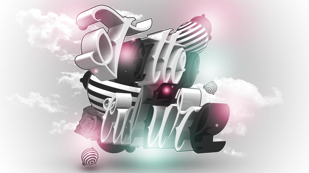
First of all let me say that usually my dislikes comments are a bit bigger, because I try to be as specific as possible and give you some useful hints. So don't be alarmed about it:
LIKES:
I loved the colors choice and the rendering feel it's pretty good. Both caught my attention and made me want to take a closer look right away. Luminosity it's also well balanced. The concept it's very good. And design it's clean and Elegant.
DISLIKES:
The outline. I understand that it's there to detach the white text from the background. Otherwise it would disappear. But to me, it kind of breaks the modern feel you gave to the whole piece. You could try something smoother, like a soft glow for instance.
The type it's good and I love it too. But It took me some time to read "culture". The perspective it's making it hard to read. Plus, The "t" in black seems to disappear in the middle of the word. Maybe rotating this word a little bit to give a better frontal view will do the job.
This is pretty particular, but the magenta glow over the "t" is bothering me somehow. I don't know if you did it intentionally, but it's calling to much attention, and maybe, helping to hide the "t". You could make it smaller and/or softer like you did on the "a" and "e".
I hope I could be of any help.